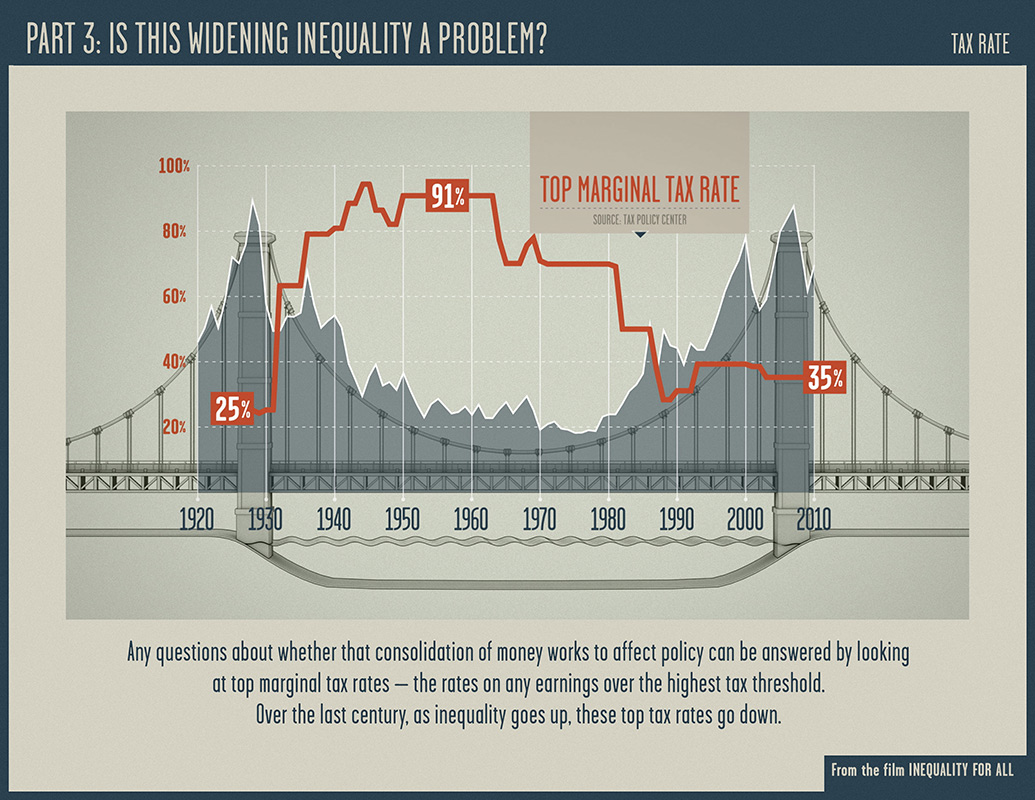
This graph shows the changes in both the top marginal tax rate (red line) and the percent of wealth owned by the top 1% (shaded grey area). The graph comes from Robert Reich’s 2013 documentary film “Inequality for All.”

Source: https://bakercountydemocrats.org/wp-content/uploads/2016/06/chart-2.jpg
